Does your kitchen’s color truly reflect your lifestyle and space? I’ve found that choosing cabinet colors for 2026 goes beyond trendy palettes; it requires understanding how light, materials, and your home’s proportions work together.
Smoky greens, deep blues, and warm neutrals are leading this year’s designs, but the real question is which palette will work best in your specific space. Let’s explore how to select colors that stick.
Choosing Your Cabinet Color: Space, Light, and Style

How do you choose a cabinet color that actually works with your kitchen’s unique layout and lighting?
Start by assessing your space. Open-plan kitchens benefit from light-stained woods and warm neutrals like mushroom, taupe, and beige. These softer tones create perceived warmth without the harshness of stark white.
Consider two-tone designs if you’re working with limited light. Pair lighter upper cabinets with deeper lower cabinets to add depth strategically. This approach prevents smaller kitchens from feeling overwhelmed.
Green emerges as the dominant trend for 2026. It works beautifully as cabinetry or accent wall color, pairing effectively with wood tones and brass hardware.
Your cabinet color should enhance, not compete with, your space’s natural light and proportions.
Smoky Greens and Warm Neutrals as Kitchen Baselines

I’ll guide you through selecting smoky greens and warm neutrals as your kitchen’s foundational colors. These palettes, from smoky jade to mushroom and taupe, create calming, nature-inspired spaces that work beautifully in any lighting condition.
You’ll discover how to pair these baseline colors with natural materials like light oak and brass for a kitchen design that feels thoughtfully put together.
Smoky Jade Palette Foundations
Why settle for stark whites or icy grays when smoky jade greens offer a smarter foundation for your 2026 kitchen?
Smoky greens create a neutral foundation that feels both grounded and sophisticated. I’ve found they work beautifully as green kitchen cabinets because they bridge cool and warm tones with a soft gray cast.
Here’s what makes smoky greens your ideal choice:
- Pair seamlessly with light oak floors and creamy stone counters
- Function as calming, livable neutrals supporting natural materials
- Suit open-plan layouts and intimate kitchen spaces equally well
- Complement matte hardware for cohesive design schemes
- Align with NKBA trend guidance favoring nature-linked palettes
Behr Hidden Gem exemplifies this aesthetic on islands or perimeter cabinets. You’ll appreciate how smoky greens establish the versatile backbone your kitchen design deserves, creating spaces where you’ll actually want to spend time.
Warm Neutral Versatility & Application
While smoky jade greens anchor your kitchen with understated sophistication, warm neutrals complete the foundation by offering flexible, livable alternatives for cabinets throughout your space. Mushroom, taupe, sandy beige, and modern khaki sit between bright white and deeper tones, creating softer visual reads that work beautifully in open-plan layouts and low-light areas.
These warm neutrals function as a “not-white” option that appeals to resale contexts while maintaining contemporary appeal. They pair exceptionally well with smoky greens, allowing you to blend natural textures across your kitchen’s major surfaces.
To maximize versatility, pair warm neutral cabinets with light-stained wood floors, creamy stone counters, and unlacquered brass hardware. This combination grounds your palette while achieving the nature-forward aesthetic that’s current in 2026 kitchen design.
Natural Material Pairing Strategies
Once you’ve settled on smoky greens or warm neutrals as your cabinet baseline, the real design work begins with selecting complementary materials that amplify their natural character. I’d recommend pairing your chosen palette with these foundational elements:
- Light-stained wood like Rift-sawn white oak or walnut
- Warm veined counters such as travertine
- Unlacquered brass hardware for subtle warmth
- Natural stone surfaces with organic movement
- Matte finishes that reduce glare
These pairings create spaces with a sense of purpose that feel well-considered. Smoky greens and warm neutrals work well alongside natural textures, establishing that calming aesthetic many homeowners seek.
When materials echo nature’s palette, your kitchen becomes a sanctuary; not just functional, but genuinely restorative. This strategic layering of warm woods, stone, and hardware takes baseline cabinet colors into sophisticated, livable spaces.
Indigo and Midnight Blues: Why They Dominate 2026
Indigo and midnight blues create a calm luxury aesthetic that gives your kitchen the feel of a sophisticated retreat, especially when you have larger spaces or excellent natural light to showcase their depth. I recommend using these rich tones on islands or tall cabinetry as focal points, where they’ll anchor your design while maintaining visual balance throughout the room.
You’ll achieve the most luxurious effect by pairing these navy shades with burnished brass or brushed nickel hardware and cool-veined stone countertops.
Calm Luxury Aesthetic
Why are deep blues becoming the go-to choice for kitchens seeking understated elegance? Indigo and midnight blues create a calm luxury aesthetic that brings sophistication to your kitchen. These cabinetry color trends work beautifully when you balance them with lighter elements, avoiding heaviness while maintaining refinement.
To achieve this look, consider these design pairings:
- Benjamin Moore Hale Navy or Farrow & Ball Hague Blue as your primary color
- Shaker-style cabinet doors for timeless appeal
- Cool-veined stone countertops for contrast
- Burnished brass or brushed nickel hardware
- Light-colored walls or open shelving for balance
The result is a kitchen that feels both grounded and luxurious. These deeper tones work exceptionally well in larger, well-lit spaces where you can feature them on islands or tall storage units as focal points. You’re creating a timeless sanctuary that avoids trendy pitfalls.
Optimal Lighting Applications
How you light a deep blue kitchen determines whether it feels sophisticated or shadowy.
Indigo blues demand strategic lighting to achieve that calm luxury aesthetic you’re after. I recommend layering multiple light sources: overhead fixtures, under-cabinet lighting, and pendant lights. This approach illuminates your space evenly and prevents uneven shadows.
Position brighter lighting near islands or tall storage units where you’ve placed your darkest cabinetry. Natural light also plays an important role. Large windows or skylights help balance the visual weight of midnight tones.
During evening hours, warm-toned LED bulbs (2700K-3000K) enhance the grounding quality without creating harsh contrasts. The key to balance is keeping perimeter areas lighter while your indigo focal points remain prominent. This prevents your kitchen from feeling cave-like.
Quality lighting makes deep blues into luxurious design choices that invite you to stay longer.
Deep Brown and Burgundy Cabinets for Moody Kitchens

If you’re seeking a kitchen that feels both sophisticated and intimate, deep brown and burgundy cabinets deliver that moody aesthetic beautifully. I’ve found these rich tones create layered depth without relying on flat black, offering genuine luxury.
Consider these design elements:
- Espresso with charcoal undertones for sophisticated foundation colors
- Aubergine-inspired burgundies for dramatic visual contrast
- Tumbled limestone countertops to complement cabinet richness
- Aged bronze hardware for authentic, refined details
- Fluted wood panels to enhance dimensional interest
These colors suit moody modern or classic English pantry aesthetics exceptionally well, especially in naturally lit spaces. You can apply them to full cabinet installations or accent islands and pantries. This approach creates a polished, dramatic contrast that invites you into a truly personal space.
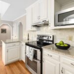
Pale Cream Cabinets: Warmth Without Compromise
Pale cream cabinets offer a sophisticated alternative to stark white, delivering genuine warmth while keeping your kitchen feeling open and inviting. These warm off-whites blend comfort with refinement, creating the perfect middle ground between bright whites and beiges.
I find pale cream cabinets particularly valuable for kitchens with limited natural light. They brighten spaces without the clinical harshness of pure white, making them ideal for resale-focused updates.
To maximize their potential, pair them with warm woods, softly veined taupe or gray countertops, and brass or brushed nickel hardware. These combinations enhance the natural warmth these cabinets provide.
Pale cream cabinets align well with 2026 trends favoring less-than-white neutralals and natural texture. They reflect light effectively while establishing a warm, refined aesthetic that welcomes both family and guests into your culinary space.
Yellow and Ochre Cabinets for Bright Spaces
While pale cream cabinets work beautifully for warmth and openness, yellow and ochre cabinets take that inviting feeling further by actively brightening your kitchen with color. I find these hues add visual interest to spaces by introducing sunshine without overwhelming the room.
Yellow and ochre cabinets work best when:
- Paired with cream walls to balance warmth
- Installed in north-facing kitchens needing natural light
- Combined with walnut or oak accents
- Finished with warm countertops and terracotta flooring
- Chosen in soft, modern tones rather than bold shades
The 2026 trend emphasizes subtle warmth over stark brightness. These cabinets suit cottage-style kitchens and cheerful family spaces perfectly. Light wood finishes enhance the palette while maintaining visual harmony. The result is a kitchen that feels both inviting and deliberately designed.
Stained Wood: Grain, Texture, and Natural Character

How do you bring authentic wood character into a modern kitchen without overwhelming the space? Stain finishes preserve the wood grain while incorporating warmth through natural tones ranging from light oak to walnut. You’ll appreciate how this approach creates texture that painted cabinets simply can’t match.
Clear hardwax oil allows the natural texture to remain visible, establishing authenticity without heavy color. Pair stained wood with soft white quartz countertops, simple white tile backsplashes, and matte black or brushed brass hardware. This combination emphasizes grain patterns while maintaining visual balance.
Open-plan kitchens benefit most from lighter stains. They introduce warmth and durability in high-traffic zones without introducing strong color that demands attention. The result is sophisticated, livable space that feels both modern and grounded.
Two-Tone Kitchen Cabinets: Pairing Colors for Depth

Two-tone cabinetry creates visual depth and sophistication by pairing contrasting colors. I’ll show you how this trend achieves balance while showcasing your personal style.
Smart Pairing Strategies:
- Soft or neutral uppers with richer, deeper lowers for visual interest
- Neutral perimeter cabinets paired with a bold island as a focal point
- Light tops contrasting with textured lower finishes for dimension
- Complementary hues that maintain overall kitchen cohesion
- Materials and finishes that highlight contrast without overwhelming
The contrast between cabinet tones draws the eye through your space, creating layers of visual appeal. Two-tone cabinets let you explore color confidently while keeping your kitchen feeling balanced.
Avoid overloading with too many bold elements simultaneously. Instead, anchor your scheme with one strong color choice, allowing depth and dimension to emerge naturally through strategic placement and thoughtful material selection.
Testing Cabinet Colors Before You Commit

Once you’ve explored two-tone cabinets and identified colors that appeal to you, the next step is testing those shades in your actual kitchen space.
Lighting dramatically affects how cabinet colors appear throughout the day. Natural light, overhead fixtures, and task lighting all influence color perception. Paint large swatches on your cabinet doors or walls to observe these changes over several days.
Consider your space balance carefully. Test how potential cabinet tones interact with existing wall colors like soft greige or creamy white. Notice how new shades complement your countertops, flooring, and backsplash.
This testing approach lets you explore color confidently without committing to permanent changes. You’ll discover which combinations create the unified, balanced kitchen you envision for 2026.