
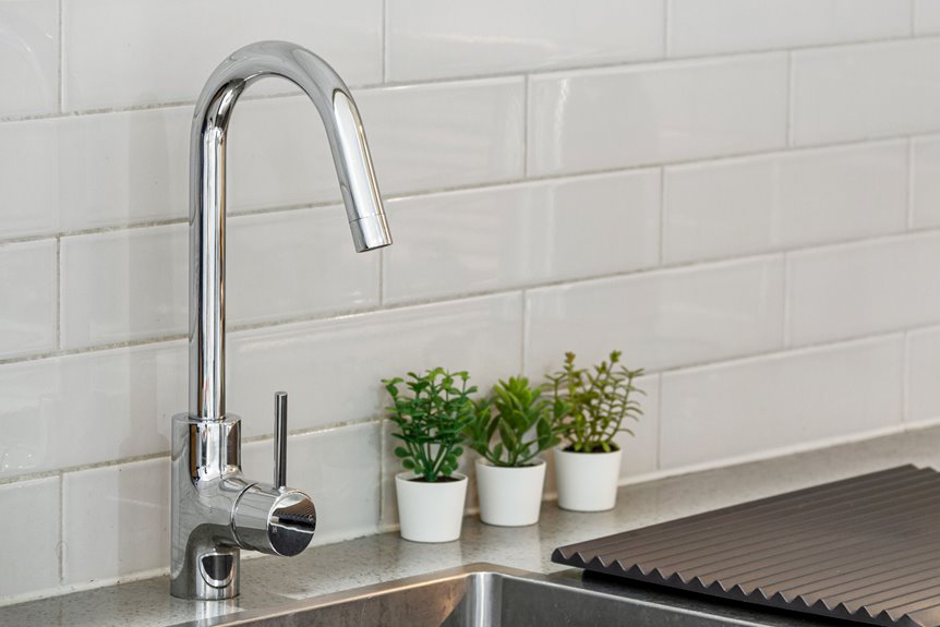
Your kitchen splashback deserves more than basic tiles. I’ll show you seven approaches that create visual interest in this practical zone. From mixing geometric shapes to layering textures, you’ll discover how thoughtful material choices improve your entire kitchen. Each strategy balances aesthetics with durability.
The real appeal comes from seeing how lighting and finishes work together. Different materials catch light in unique ways, and the right finish can completely change how your splashback looks throughout the day.
Mix and Match Splashback Tile Shapes for Visual Rhythm

Have you considered how different tile shapes can create visual interest in your kitchen backsplash?
Different tile shapes—rectangles, squares, hexagons—create visual rhythm and interest in your kitchen backsplash design.
I’ve found that mixing rectangles, squares, hexagons, and custom pieces creates visual rhythm while maintaining design cohesion. A dominant shape anchors your backsplash, while secondary shapes establish focal points and movement across the surface.
Cavity-molded tiles provide consistent sizing, making mix-and-match combinations seamless. I recommend varying tile sizes and finishes; incorporating metallic or glass accents adds texture and shimmer without overwhelming your space.
Balance is essential. Bold shapes need simpler sections nearby, allowing your eye visual rest. This prevents the backsplash from feeling chaotic.
Start by sketching your design on graph paper. Order samples and test combinations under your kitchen lighting before committing. This approach confirms your final backsplash works with your existing color palette and style.
Layer Textures and Finishes to Add Dimension

You can redesign your splashback by layering different textures and finishes that work together beautifully. Combining matte and glossy surfaces creates visual depth, while strategic pairing and smart lighting choices enhance your kitchen’s dimension and style.
Mixing Matte And Glossy
Why settle for a flat backsplash when combining matte and glossy finishes can add visual depth to your kitchen? I recommend using matte tiles for your larger field areas to soften light and reduce glare effectively. This approach creates a sophisticated foundation for your backsplash texture.
Next, apply glossy or metallic accents on borders and focal panels to catch the eye and enhance light reflection. This tile layering strategy prevents your design from feeling busy while maintaining visual interest.
Here’s my tip: choose finishes within the same color family. Matte textures absorb light for subtlety, while glossy surfaces highlight details and intensify colors under both natural and artificial lighting.
Before committing, test samples in your actual kitchen lighting. Observe how matte and glossy finishes interact with your cabinets, countertops, and hardware. This confirms your vision becomes reality.
Strategic Texture Pairing Methods
When you layer textures strategically, you’ll create dimension that makes a flat backsplash into a visually compelling focal point. Combine heavily textured tiles with smoother accents to build interest while maintaining visual balance in your backsplash design.
The key to successful texture pairing is using lighting to enhance your dimensional surfaces. Bright overhead lighting emphasizes raised patterns and shadows, while softer ambient lighting creates a gentler effect that showcases texture without overwhelming the space.
Consider mixing finishes by pairing matte textured tiles with glossy accents; this creates contrast that catches light differently. This approach prevents your backsplash design from feeling chaotic or competing with other kitchen elements.
Run your hand over samples before committing to textured tiles. Check that the texture feels pleasant and remains easy to clean over time, balancing aesthetic appeal with practical durability.
Lighting’s Impact On Dimension
How light hits your textured backsplash determines whether those layers read as striking depth or subtle detail.
Bright overhead lighting enhances pronounced textures, creating dramatic shadows that amplify your splashback’s dimensional quality. This intensity works beautifully with deeply textured tiles, making every ridge catch light and glow. Conversely, softer ambient lighting yields gentler textural effects, allowing matte finishes to feel inviting without overwhelming your space.
Consider your kitchen’s natural light exposure. South-facing windows provide consistent brightness that showcases glossy tiles’ sparkle and reflection beautifully. North-facing kitchens benefit from warmer accent lighting that compensates for cooler daylight.
Match texture finishes strategically with your lighting plan. Pair heavily textured tiles with smoother accents, preventing chaos while maximizing depth. This balance keeps your backsplash visually compelling throughout the day, regardless of shifting light conditions or time of year.
Make a Bold Color Statement Without Overwhelming Your Space
I’ve found that the key to making bold colors work isn’t choosing the boldest shade; it’s knowing exactly where to place it and what neutral tones to balance it with.
You’ll want to concentrate your vibrant hue on one wall or a focused backsplash area while letting soft whites, grays, or natural stone tones support the rest of your kitchen. This strategic approach keeps your bold statement as the main attraction rather than creating visual chaos that overwhelms the room.
Strategic Color Placement Techniques
Why do some kitchen splashbacks command attention while others fade into the background? Strategic color placement creates a unified palette that energizes without overwhelming.
I recommend viewing color samples under your actual lighting conditions first. Natural and artificial light reveal how bold color truly appears against cabinetry and countertops.
Here’s my approach: anchor one dominant hue as your focal point, then layer supporting tones deliberately. Pair warm-colored stones with amber lighting for balance. Cool-toned materials work beautifully with clear or blue-tinted glass fixtures.
Test your selections on a sample board positioned in your kitchen. This confirms everything works together before installation.
Consider placing your boldest color where it naturally draws eyes, typically behind your cooking zone. This strategic placement creates impact while maintaining overall visual harmony throughout your space.
Balancing Bold With Neutral Tones
When you choose a striking backsplash color, everything around it becomes part of the conversation. I recommend pairing your bold color with calm neutrals to create visual harmony. Warm jewel tones like deep teal or amber work beautifully when surrounded by light countertops and subdued stone or glass finishes.
Test your bold color samples under both natural and artificial kitchen lighting before committing. This helps your backsplash complement existing cabinetry and flooring.
Consider applying bold color strategically, perhaps as a border or single feature wall rather than across the entire surface. Add subtle texture through textured tiles or modest mosaics to introduce depth without competing with your focal color. This balanced approach lets your backsplash become a notable accent while maintaining cohesion throughout your kitchen.
Choose Glass and Metallic Accents for Light and Brightness
How can you brighten your kitchen while adding modern sophistication? Glass splashbacks reflect light beautifully, creating an airier feel and expanding your space visually. I’d recommend pairing glass with metallic accents for enhanced brightness through reflections.
Choosing Your Metallic Finish
Select finishes strategically based on your existing fixtures. Gold and brass provide warmth, while silver and chrome offer sleekness. Copper delivers industrial charm. These metallics work as borders or focal points, not full coverage.
Applying Your Backsplash Design
Use metallics sparingly to avoid overwhelming your kitchen. Small accents paired with glass create sophisticated balance without excessive reflectivity. This combination maintains contemporary depth while keeping your space feeling open and inviting.
Your backsplash design becomes a statement reflecting your personal style and design vision.
Design an Artistic Splashback With Mosaic Patterns

If you’re ready to create a personalized gallery in your kitchen, mosaic splashbacks offer the perfect canvas for artistic expression. I recommend combining glass for luminosity, stone for natural texture, and ceramic for durability to create visual interest.
Start by sketching your design on graph paper, then test samples under your actual kitchen lighting. This ensures your focal mosaic element works with your space’s color scheme and style.
Mix tile sizes and finishes strategically across your backsplash. Use a dominant color palette with accent colors to avoid visual overload. Consider metallic tiles for shimmer and dimension.
Your mosaic patterns make the backsplash a unique focal point. The layered textures and varied materials create depth and movement that reflect your personal style and design vision.
Combine Natural Stone and Glass for Timeless Elegance

Natural stone and glass create a sophisticated backsplash that marries warmth with contemporary shine. I’ll show you how strategically placing glass accents, like borders or focal mosaics, defines sections while adding shimmer to your kitchen. This combination establishes an elegant focal point that improves your entire space.
| Stone Type | Best For | Glass Color Match |
|---|---|---|
| Marble | Veined luxury | Soft white or cream |
| Granite | Bold variation | Earth tones |
| Slate | Natural texture | Charcoal or bronze |
Stone resists heat and staining with proper sealing, while glass cleans easily with standard cleaners. Varying finishes between polished and honed stone creates texture and depth.
Your natural stone and glass backsplash will remain beautiful for years with this classic approach.
Select Splashback Materials That Last

Your backsplash faces daily heat, splashes, and stains, so choosing durable materials now saves you headaches later. I recommend selecting hard-wearing options like granite or quartz that resist damage and maintain their appearance for years.
Glass backsplash materials offer an earth-friendly advantage: they’re incredibly easy to clean with standard tile cleaner. However, natural stone requires proper sealing to prevent staining and protect your investment over time.
Test samples under your kitchen lighting before committing to any backsplash materials. This real-world assessment confirms how each option performs against daily cooking challenges.
Balance durability with aesthetics by combining stone with glass accents or mosaics. This approach gives you a lasting, low-maintenance surface that looks beautiful.
Prioritize your maintenance schedule. Consistent sealing and cleaning preserve appearance and extend longevity significantly.